I've always enjoyed the process of learning; flexing a new muscle you never knew you had, dusting off skills you've since stored away, and opening your mind to a new perspective.
I do a lot of on-the-job learning as a project manager in a creative industry. I'm required to get in the heads of strategists, designers, and developers on a daily basis, regardless if I've ever had the experience of being one myself. Which, got me thinking...what if I did?
I enrolled in a User Experience (UX) Design course through General Assembly as a way to connect with my project team and get out of my normal routine. This course had me playing the role of researcher, strategist, and designer for my very own product idea, THRIVE.
The Project
THRIVE is a mobile app concept that allows plant owners to pair their plants and spaces together for optimum coexistence. It provides quick assessments of the environmental conditions of one's space to aide in easier plant selection and ongoing care.
Over this 6-week course, (a total of 80+ hours of work), I conducted all phases of the UX design process, culminating in a final presentation and clickable prototype. I also learned how to use industry-standard tools such as Sketch and Invision.
Project Phases
Affinity Mapping
After collecting data points from user research, identifying themes in data informs how to prioritized product features.


Persona Development
Based on market research, user interviews and affinity mapping, the creation of a user persona helps prioritize product features.
Storyboarding
Role playing as the user persona helps think through what problems the app needs to solve. It also helps to prioritize features for a minimal-viable product.


User Flow
A user flow maps every possible interaction on THRIVE. This is then vetted with usability testing and card sorting.
Sketches & Card Sorting
Rough sketches were used to think though various features and interactions. This was then vetted by usability testing and iterated on.

Wireframes
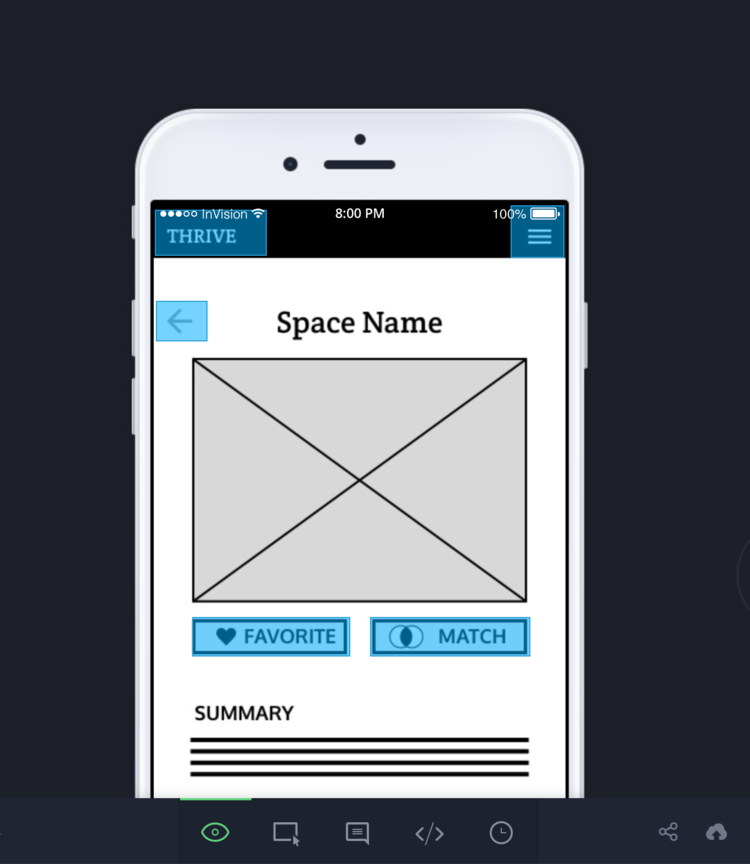
Hi-fidelity wireframes transform paper sketches to more visual representation of the product.

Prototyping
A clickable prototype can simulate several sequences for an MVP version of the THRIVE app.

The Outcome
The best thing about this course, for me, was being able to look at project from the inside-out, instead of the outside-in. I was precious of the data, and the insights I drew from it. It was hard to self-edit and stay on task when there were so many possibilities in front of me, especially when challenged to distilling it all into a succinct presentation. I grew such a great appreciation for what my fellow strategists and creatives do on a day-to-day basis. I understood their stressors as well as their passion for it. Empathy is at the heart of any good design, I learned, and that has never felt more true. This project has given me the empathy needed to better support my project team, to put things in their language, and myself in their shoes. And most of all, it was super fun to step outside my box and discover something new.
